Tuesday, February 28, 2012

Can't Miss: 24 Magazine

I came across this from skimming through MagCulture blog today. What first caught my eye was the logo...


I have this thing for perfectly fitting letters/numbers together (like the above logo), so I had to click and find out more. I had never heard of 24 Magazine before. Maybe because it started six days ago.


"Starting on February 23, 2012, at 10am, we're making a magazine in 24 hours. Because we are optimistic to a fault. " ---24 Magazine tweeted


The concept of the magazine is to make a magazine in 24 hours. Clearly these people don't have problems with deadlines. Ten people got together to make it, including photographers, writers, editors, illustrators and designers. Pretty remarkable stuff! 


Click here to find out more.

http://twentyfourmagazine.com/

Critique: True/False cover

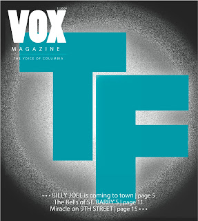
I haven't done much designing since last Wednesday since I've been preparing for my Good Housekeeping presentation over the weekend. Last week was design-overload for me so I was happy with this little break. For class on Thursday I did my second draft of my True/False Flim Fest cover. I was pretty happy with is because I found a really awesome T/F picture to go with it. If you go back to my 3 first draft covers from my blog posts last week, I decided to execute the 3rd cover -- but somehow managed to completely take a different route.


I decided to kill the idea of listing the films inside the T and the F since it was a) really hard to find a way to make them all fit inside perfectly and b) it was super overwhelming and didn't look organized whatsoever. So I went with no fill, which I thought worked well, capturing the T/F logo inside the bottom of the T. I was also happy with how the F overlapped the T just perfectly.

These little details get me very excited. I think I really love designing covers.

Response: History Presentation

For our magazine history presentations this week, I chose to critique Good Housekeeping in the 60s. I chose this magazine because I've been doing research on how to handle recipes and food articles for my Better Cook prototypes. I found lots of interesting stuff. I don't read Good Housekeeping very much right now, but I found it interesting comparing it to how magazines with recipes work now. Magazines with recipes now tend to have quite a bit of design elements... little measuring cups to determine cooking measurements, little clocks to determine how long it takes to make, etc. I found that not only the recipe slides were text heavy, but the stories in general were as well.

What I love most about the research I did was the covers (probably because covers are my favorite part of magazines!) I found myself sitting in the stacks for quite a while flipping through the collections admiring all the covers. What I found particularly interesting was that the art director was there from 1960-1969 and the masthead changed 3 different times.


The changes were even pretty drastic, going from big, block "G" and "H" to a serif font to a sans serif font. It's interesting even comparing sell lines from issue to issue, not staying very consistent. Magazines now are usually so formatted with how they handle sell lines.

Although presentations aren't quite a designers best friend, I enjoyed doing this project. I didn't realize so many magazines were so easily accessible right there at the library. They might be located in the scariest part of the library but definitely worth using as a resource in the future!

Wednesday, February 22, 2012

Can't Miss This: Liquid Layout

So I've been working on designing the VOX iPad issue for this week. It has required an unbelievable amount of patience, but I have enjoyed it. What I found most difficult was designing everything twice -- in landscape and portrait -- but that also might be my most favorite part of it. It was definitely a challenge, but I liked the challenge.


So I found this post on my blog that I've been following, magculture.com/blog, about "Liquid Layout." Below is a video they had on the post:

http://youtu.be/JZJ6r3VyU5g

I found it particularly interesting because it is all what I have been spending my last couple days doing: transferring a print issue into an iPad production.


They also included a link about how magazines are keeping up with the times and technology, especially with all types of tablets coming out, like the Kindle Fire, and not just the iPad.


http://paidcontent.co.uk/article/419-conde-nast-aims-to-unify-tablet-and-mobile-magazine-production/


Enjoy!

Response: Prototype Presentation

On Tuesday, my design group presented our prototypes for Better Cook to our publishing team. It's so cool how three people can be given the same mission statement and the same goals of the magazine's image and create completely different magazines. We all had completely different color palettes, and I loved seeing how everyone else envisioned the magazine.

I'm really excited working with my publishing team and the other designers to create this magazine. I think everyone has something different to bring to the table. All 3 of us designers have different ideas and styles that I think will really work well together and help us all be able to create a really quality magazine, and help us expand our design knowledge and experience individually.

Critique: Prototype Presentation

As far as my design work load goes for this past week, this one probably takes the cake. I've been working on covers for the True/False Film Festival, working on the iPad issue for this week and completed my prototypes for Better Cook. I'm learning that I can produce designs a lot faster than what I used to be able to do!


I'll start with my True/False covers.


For this cover, what I wanted to play up was how beautiful the F fit right under the T. I get really excited about the way letters can fit together and look pretty (lame I know) so I wanted to play up that element. Although the official True/False colors are red and black, I thought I would mix it up a little since Vox usually sticks with a red and black theme for this issue. So I went with turquoise. Looking back on it, I realize Vox probably wouldn't publish a turquoise cover because of people's initial reactions when they see it on the stand. Most people in Columbia are familiar with True/False so they're expecting a red and black color scheme that they will recognize at first. But I thought that a little change could be good.

 For this cover, I was pretty much just experimenting with Illustrator and seeing what I could do with it. I enjoy recreating things in InDesign and Illustrator and seeing how well I can do. This probably isn't my favorite cover that I've made, but I was proud of myself for making something in Illustrator instead of just sticking with InDesign. 
While this a bit of a rough cover, I have selected this cover of the three to make for the final draft. I like the whole idea of working with the words inside the "T" and the "F." The words inside are the names of the films at this year's fest. I am working on revising this cover and creating some kind of background to it to give it some sort of texture and not look so flat, however I do like the contrast of the letters to the white background.

On a different note, the other project I have been working on is for Better Cook. I took what my publishing team wanted and created a cover, department page and a feature page.


For my cover, I found this great image of a salad. I love the bright bold colors and pulling the red from the image into the masthead I thought it all pulled together nicely.


For this department, it would feature different meals that can be made in a quick amount of time. This magazine is all about quick stories, where you don't have to allow a lot of time to read through story after story but instead be able to flip through and find pieces of information that you need.


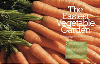
This is one of the possible features in the magazine. I wanted to have just one big image on the cover because it is eye-cathing, and also goes with the color palette of the magazine. "The Breakdown" features a variety of vegetables, that could give different information about them, including tips on growing/watering them, fertilizer to use, interesting facts about them, etc.


I have also been working on designing the iPad stuff, but it's not 100% completed yet. So you all will have to wait patiently for next week! :)


Wednesday, February 15, 2012

Can't Miss This: 40 Insanely Creative Anti-Smoking Ads

I'm aware that I am not a Strategic Communications major, but I find advertisement designs so fascinating. They're so similar to magazine designing in many ways because they also tell a story visually.

So we all invested a lot of time into our cigarette rolling stories. So when I came across this article "40 Insanely Creative Anti-Smoking Ads" it (naturally) immediately grabbed my attention. We all spent so much time trying to think of creative ways to tell the story, some of us branched out more with doing cool stuff in Photoshop and Illustrator (which I did not) but looking at these ads prior to would have really inspired me! Take a look...

http://www.tripwiremagazine.com/2011/08/anti-smoking-ads.html?

This one's my favorite. I love the smoke coming off of it. And I'm thinking they traced the shape of a lung in a pile of cigarettes but I'm not really sure? If I had more time I'd try to recreate this... buttttt I don't!

Enjoy looking at the rest of these!

Critique: Better Cook

My designing this week consisted of creating a cover and a department page for Better Cook, the magazine my publishing group has been assigned to. The members of my group described the vision of the magazine to have a fresh tone, easy-to-read pieces, colors you would want in a kitchen, free from pastels and nontraditional. I found it to be not very specific, which made it kind of difficult to create an overall theme. I wanted to include bright, bold colors, instead of lighter colors, because I love bright colors and am not a fan of pastels at all, especially in a kitchen. So alas, my cover...


I loved hearing all of the comments about it from my classmates. Overall, they liked the crispness to it and also the way I did the logo. I played around with the logo quite a bit, but decided to keep it simple. Since my publishing team wanted a magazine that is a "quick read," I didn't want to do a whole lot with it. I also felt like it had a "Better Homes & Gardens" feel to, but not too similar.

This is my first draft, and I haven't made the changes that my classmates suggested yet, I wanted to put it up on my blog first so I can show my progress. I'm going to work with the sell lines some more, and create better balance, maybe more one to the top left. We'll see. I'm also going to move the "10 healthy recipes" stamp to a different spot and make it not as much a part of the logo. But overall, I think everyone really liked the picture. (The one thing I can't take credit for!)

I also designed a department page...


"Meals by the Minute" would be a department that would be in every minute, showcasing a different recipe that can be made under a certain amount of time (15 mins, 30 mins, 1 hour, etc.) I stuck with some more bold, bright colors that I pulled from the color palette from the cover. Might change it to some warmer colors though. More my thing. It's been really fun searching for pictures for this project. I find myself looking at them in my free time... nerdy? Probably.

Response: First draft critique

I have chosen to write a response about our first drafts we presented to the class for our projects. I presented my cover and an example of a department page. It was really beneficial hearing everyone's opinions on my work, especially my cover. As great as it is hearing what people like about my work, I'd rather receive constructive criticism about it so I can make the proper changes that it needs so I can present the best possible product to the rest of my publishing team. I find it so interesting that we are all presented the same assignment but can all create such different and unique designs from each other's. I enjoy seeing everyone else's designs in my class so I can get inspired by what other people are doing.

Wednesday, February 8, 2012

Can't Miss This: How to Beat Designer's Block Like a Kung Fu Master

We've all dealt with it. We've all starred at the computer screen for hours on end looking not knowing what more we can possibly do to this design. It's a little something called "designer's block" (yes, incredibly similar to writer's block.) I found this helpful article to give designers ideas on what to do when they can't stare at a screen any longer.

Before I found this article, I found going on a run helped me a lot. Also coming back to it a couple days later, (or hours if I don't have that luxury), gives me fresh new eyes and new ideas. But my favorite thing from the article that I had never thought of before was getting inspiration from things besides other magazine layouts. Such as bags, purses, anything that has patterns... like below!


So check this site out!
How to Beat Designer's Block Like a Kung Fu Master

Response: Getting Work Published

Building off my last post about critiquing my covers, I wanted to talk a little about my experience with getting my work published. It's really interesting and beneficial getting to hear everyone's opinions about my work, especially from professors and the editors up at Vox that have had an unreal amount of experience in the real magazine world. It definitely gives me more confidence about my design work!

What I found crazy was how many changes I made from the beginning draft to the very end. It has a completely different feel to it, completely different color scheme, went from a typography cover to a cover with a stock photo. I am really happy with how it turned out and it was great working with the art directors, my TA, the editors up at Vox and other students hearing what they like best and what I should incorporate into it. I learned how important it is to be able to take constructive criticism with my work and to make certain changes to keep everyone happy!

Critique: Cover Process

So for the past couple weeks, I've been working very diligently on my cover(s) for Vox's "Afterlife" issue, which comes out TOMORROW! I was assigned to first start out with 3 covers, making them all completely different. I found it really difficult to think of themes for each one since afterlife isn't an actual object I can take a picture of. Everyone has different views of what afterlife can be so it was important to gear it towards all audiences.

So two weeks ago, I turned in the following 3 cover designs:


I was told to make one a typography cover, one an Illustration cover and one a photography cover. My favorites were the first and last one, and when I presented them to the Vox staff, they agreed. They shared their input on all three covers and I was to then pick on after hearing their thoughts and make the proper changes for next week's critique. I was going back and forth between the first and third cover, but decided to do the first one. If I picked the third one, I would have to find someone to photograph (since I obviously could not get Glenn Beck to do it for me), and I thought that it would have been difficult finding someone when this was such a quick turn-around.

So I made the proper changes, and voila! I present to you the next draft!


The Vox staff wanted me to keep the question mark theme, but give it a more "light-hearted" feel, since the stories in the issue weren't as "dark" as my cover was.

After presenting this draft the next week, I was the lucky winner and they chose to publish it! So the next step was to make even more changes.

I was told to incorporate some kind of "cloud" theme on the cover, but keep the question mark. We didn't want it to be too "heavenly" and too literal for the reader, so we put cirrus clouds on the cover. (No, I did not know what cirrus clouds were before this experience.)

So I made 3 new covers for the art directors/TA's to pick from:


We ended up going with the first ones, since the cirrus clouds didn't scream out heaven. I never thought I'd spend so much time inspecting question marks in my life. We wanted a rounded question mark, because the blocky question marks (like the second one) didn't quite fit the overall feel of the issue.

The first cover was selected and will be published. It comes out tomorrow and I'm very excited to see how it turns out!


Wednesday, February 1, 2012

Response: The September Issue

Like many other people in class, I'm choosing to write a response on The September Issue. I had never seen it before but had heard lots about it so I was excited to see it. I, of course, (like every other girl) have seen The Devil Wears Prada and it amazed me how great of a job Hollywood did mimicking Anna Wintour's style as an editor. It's so fascinating how she sets the trend for the entire fashion world. People look to her for what's going to be in. Advertising plays such a big role in magazines, especially the September issue of Vogue, because it reaches the hands of so many people.

What I loved watching in The September Issue was the interaction/relationship between Anna Wintour, the editor-in-chief, and Grace Coddington, the creative director. Anna doesn't have a warm and friendly personality. Her main focus is clearly to get business done, and Grace is more of a people person and works well with not only her coworkers but also the models. I think it is important to be business minded, but also be able to build relationships with the people around you.

You Can't Miss: Brochure Designs

For the past 3 summers, I was a marketing intern at Maxus Properties, which is a real estate company in North Kansas City. My duties were to create various marketing material to distribute to surrounding companies/shops/stores in the area. I made a lot of flyers and brochures but struggled with ways to make them eye-catching and different from previous ones I had already made.


I recently came across this website that shows 17 different ways to create business brochures. Their biggest piece of advice is to make them full-color. They tell you to think of your brochures like movies - "Do people want to watch the latest films in black and white nowadays especially when these can be viewed in 3D? I think not."


Even if you're not looking to make an eye-catching brochure, I'd still check it out!

Critique: Spring Preview

Welcome back to my blog!

Our next big assignment was designing a cover, splash page and spread for Vox's Spring Preview issue. I had looked at quite a few examples from previous years, and decided to pick a direction that wasn't quite so "spring" obvious. I saw lots of spring related themes, such as flowers, rainboots, etc., and decided I should go a different route since those had already been done. However, what I did know I wanted to incorporate were bright colors.

I think the most difficult part of this assignment was picking a theme. After lots of time spent brainstorming, I was trying to bounce ideas off my roommates to see what they thought. I realized when explaining the assignment to them, and explaining what the issue would cover, such as all the different venues different events were being held all over Columbia, I thought of doing a gameboard theme.

My cover:


I was pretty excited about my theme, because I thought it allowed for much creativity. Plus I loved being able to use all different colors, of all different shades.

Below: splash page and spread


I was pretty happy about my final products. I was able to play around with different types, a wide variety of colors, and most importantly, (minus the 5 constant days of stress about it and working in the lab till the wee hours), I actually had a lot of fun in the process of it all! That's all that matters, right? :)