
Wednesday, April 11, 2012
Response: Book cover designing
Designing book covers is not easy. It's quite a bit different from designing a department page or a feature spread. While its still about visual storytelling, you have to think more on the marketing sign of designing. You only have a couple seconds to sell someone on the book, it has to be eye-catching enough to keep the potential reader from continuing to walk by. While it has to be eye-catching, it also has to capture the overall feel of the book in just a small little space, which was what I struggled with. I really liked the image that they provided for us but I had a lot of fun working with different typography.

Critique: Book Covers
I've never designed a book cover before, but I've always wanted to. I love designing department pages, but designing book covers is a great way to mix up our usual design work.
The book I am designing a cover for is called "Madam Chairman: Mary Louise Smith" which is a biography on Mary Louise Smith, the Iowa grandmother who was selected by President Gerald Ford to serve as the chairman of the Republican National Committee. We were assigned to make 20 rough sketches of completely different ideas, so keep in mind, emphasis on the 'rough.'


The book I am designing a cover for is called "Madam Chairman: Mary Louise Smith" which is a biography on Mary Louise Smith, the Iowa grandmother who was selected by President Gerald Ford to serve as the chairman of the Republican National Committee. We were assigned to make 20 rough sketches of completely different ideas, so keep in mind, emphasis on the 'rough.'


I struggled to come up with 20 completely different ideas. It was especially difficult because I've never done this before. I was given just one image to work with, so I played around with some photography covers as well as some illustrations and typography covers. I found that I liked my beginning covers the best and then my ideas got progressively worse... hence my license plate idea (sorry Nick!)
Wednesday, April 4, 2012
Can't Miss: Funny business cards
So most of us are trying to find jobs, and for me it's difficult finding a way to stand out from other applicants. We all have our own style, trying to brand ourselves, so you're not just another applicant in the pile. I came across this website with funny business card ideas, just another way to stand out!


Critique: Better Cook prototypes - first draft
Here are the designs I've finished so far for Better Cook. I've loved designing food spreads, mainly because the pictures are so pretty and it makes me really hungry just looking at them. I'm really happy with the way they've turned out. I love the typefaces we've been using and the bright colors. Take a look!


Let me know what you think!


Let me know what you think!
Response: Better Cook experience
So we've all been working diligently on designing our magazines, getting ready to present the first draft to our publishing team on Thursday. Yesterday we got to see all the other groups' first drafts and it was really great seeing everyone's ideas. Since we've been working on a food magazine, it was interesting seeing the other group's food magazine ideas. Each group handled their magazines so differently yet we all have such similar content.
I've really had a lot of fun designing these magazine prototypes since it's very "real world experience" (from what I imagine). What has been difficult about the experience is all of the little details matching up with the rest of my design team. It's the little things like whether or not we're changing tablespoon to tbsp or if we're bolding the ingredients or if we're using the thin font or the light font. It makes me realize how important communication is! I'm lucky I've been put with the designers on my team because we really work well together and have similar style.
Thursday, March 22, 2012
Response: Portfolio Process
So
we've all been working on compiling all of our design work for our portfolio. I
talked a little last week about the feedback I received from my fellow design
classmates, which was really helpful getting fresh eyes to look at my designs.
I find I look at my work so much that I never notice the things that other
people notice right off the bat. I've been into looking at other designers (not
from our class)'s blogs lately that showcase their design work. One thing I've
picked up on is that nobody else that I've come across has iPad work. How
awesome is that! It definitely makes us stand out from other designers and puts
us ahead of other contestants for jobs, internships, etc. Magazines are
transforming into different types of platforms that it's very important as a
designer to stay on top of the newest technology, especially when trying to
find a job!
Wednesday, March 21, 2012
Critique: DGB!
So I officially have my favorite clip. Although it's not quite your typical department page, it ran as a Scene page in Vox on Thursday. I talked a little bit about it last week on my blog, but now I have the published version!

I'm really excited about it, not only because I now have an awesome clip for my portfolio but it brought a little uniqueness and variety to Vox's usual scene department page.
I also have photos of my feature that came out in print Thursday. I was really happy with how it turned out. I ended up having to change the font just a little bit, but it wasn't too drastic so it didn't change the overall look I had for it originally.

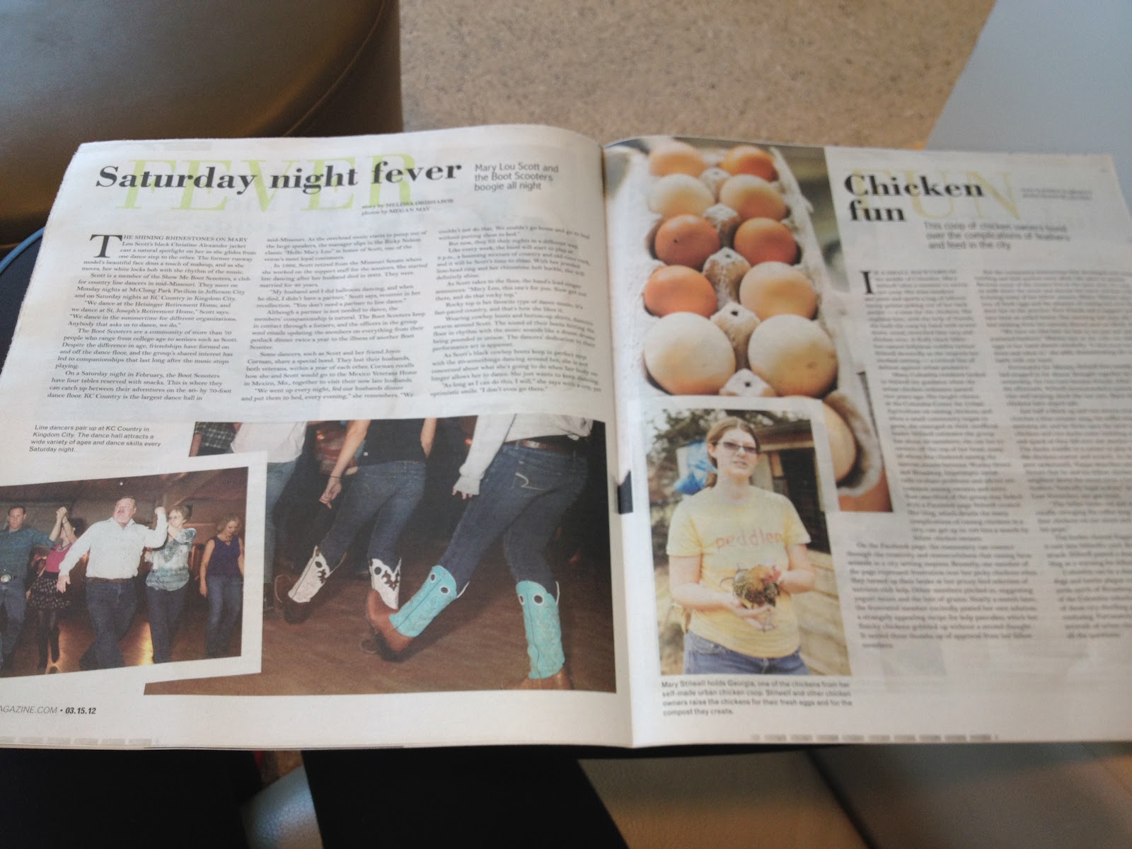


It's kind of difficult to see since it's a photo of the magazine and now the actual file, but I played around with adding color to the spreads, keeping them cohesive but giving each of them originality. I didn't use a pull color, but I picked a color palette that I thought would go with all of the spreads, which I think turned out nicely. I'm definitely glad I chose to add color instead of my original idea of keeping it all black and white.
Subscribe to:
Posts (Atom)